This
web module must appear on the same page with the Order Create and Order
Payment web modules in order to use the one-click checkout feature.
This
web module must appear on the same page with the Order Create and Order
Payment web modules in order to use the one-click checkout feature.
The Product Details web module completes the product catalog work-flow and enhances the user experience. This web module's primary objective is to display a product's information. This web module is a template-driven component, which enables you to define the user experience based on the product type as well as other attributes.
The Product Detail web part displays the information related to a product. This web part displays cross-sell and up-sell information, packages, electronic content (ECD), and any type of product components. This web part can also be used as a stand-alone product detail as it accepts the product ID via a URL parameter. This is especially useful for email campaigns requiring a link to products. It is also used in conjunction with the one-click checkout process.
This
web module must appear on the same page with the Order Create and Order
Payment web modules in order to use the one-click checkout feature.
To configure the Product Detail web module:
1. Log into your site as Host.
2. Navigate to the appropriate page on your site where you want to add the Product Detail web module.
3. From the Host toolbar, select the “Personify-Product Detail” option from the Module drop-down.
4. Click Add Module To Page.
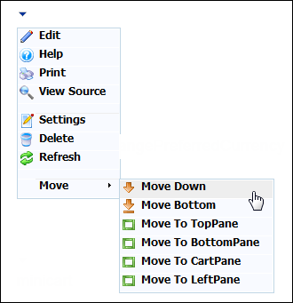
5. Move
the web module to the appropriate place on the page, as shown below.
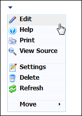
6. From
the web module menu, click Edit.
The following page displays:
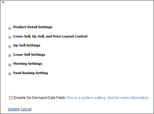
7. Configure the appropriate module settings as described below:
a. Product Detail Settings:
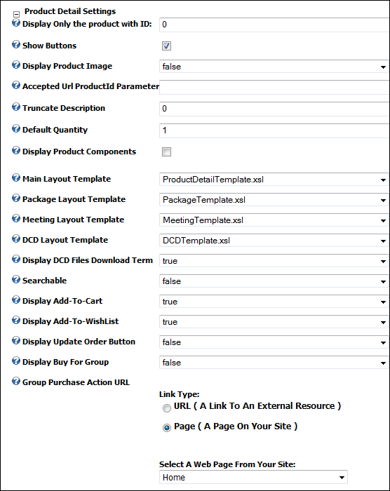
· Display Only the product with ID - Text box. This field displays the product ID. This setting can be used to set up the web module without having to depend on the product listing web module. This setting is not required for use with the one-click checkout process.
· Show Buttons - Checkbox. This option allows you to hide or display the Add to Cart, Add to Wish List, and Group Purchase buttons. If you are using the one-click checkout process, do not select this option.
· Display Product Image - Drop-down. This setting is used to hide/show the product images on the main product details section.
· Accepted URL Product ID Parameter - Text box. This setting allows you to define additional parameter keys. This is useful when integrating with third party commerce systems that are difficult to customize.
· Truncate Description - Text box. This setting allows you to define a maximum character length of the product’s description. By default, the entire (long) description is shown.
· Default Quantity - Text box. This setting allows you to choose the default quantity of a product when it is selected for purchase. By default, it is set to one.
· Display Product Components - Checkbox. When checked, the product you are viewing’s components will also display.
· Truncate Components Description - Text box. This setting allows you to define a maximum character length of the component’s description. By default the entire description is shown.
· Show Components Images - Checkbox. This setting allows you to choose whether or not any images applied to the component product display.
· Main Layout Template - Drop-down. This setting lets you modify the layout of the rendered mark-up without the need of any programming knowledge other than basic knowledge of HTML, XSL (Extensible Style Sheet Language) and XSLT (Extensible Style Sheet Language Transformations.
· Package Layout Template - Drop-down. Similar to the Main Layout Template, with the exception that this template will only apply to products marked as packages (Subsystem: PCK).
· Meeting Layout Template - Drop-down. Similar to the Main Layout Template, with the exception that this template will only apply to products marked as meetings (Subsystem: MTG).
· DCD Layout Template - Drop-down. Similar to the Main Layout Template, with the exception that this template will only apply to products marked as Digital Content Delivery (DCD) products.
· Display DCD Files Download Term - Drop-down. This setting determines if you want to display a “terms and conditions” section the customer must agree to before purchasing the product.
· Searchable - Drop-down. This setting enables you to make your product catalog searchable. To include your Personify Enterprise products data in the search, you must set up the Personify Product Indexer.
· Display Add-To-Cart - Drop-down. This setting allows you to display the “Add to Cart” button for the product.
· Display Add-To-Wishlist - Drop-down. This setting allows you to display the “Add to Wishlist” button for the product.
· Display Update Order Button - Drop-down.
This setting allows you to display the “Update Order” button. This only
used for certain workflows.
For example, if you are creating a workflow where a customer can purchase
sessions for a meeting, and the customer purchased the meeting in a different
user-session, the customer can select session products they want to add
to their previously purchased meeting product, click Update Order, and
purchase the session products.
· Display Buy For Group - Drop-down. This setting allows you to display the “Buy for Group” button for the product.
· Group Purchase Action URL - Drop-down. This setting indicates the URL where the customer is redirected for group purchases.
b. Cross-Sell,
Up-Sell, and Price Layout Control:
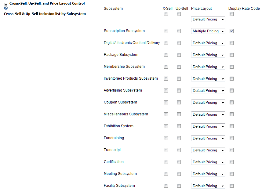
· Subsystem - Table column. Displays different Personify subsystems for which you can set up your cross-sell, up-sell, and price layout control.
· X-Sell - Table column/checkbox. The Cross-Sell column enables Webmasters to select whether or not to display the Cross-Sell section.
· Up-Sell - Table column/checkbox. The Up-Sell column enables Webmasters to select whether or not to display the Up-Sell section
· Price Layout - Table column/drop-down. Allows you to set-up of multiple pricing levels (Rate Structures and Rate Codes). The Default Pricing option will generate a list of prices for the following rate codes:
o List Price
o Member Price
o My Price
The
My Price option only appears if the user is logged in and if the user
qualifies for a price lower than the Member Price
The Multiple Pricing option will generate a list of all prices for all available
rate codes.
· Display Rate Code - Table column/checkbox. When checked, the pricing control will display the Rate Code next to the price amount, i.e. LIST $10.00.
c. Up-Sell Settings
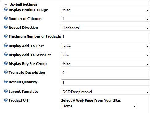
· Display Product Image - Drop-down. This setting is used to hide/show the product images on the main product details section.
· Number of Columns - Drop-down. This setting allows you to choose the number of columns of products that display on the page.
· Repeat Direction - Drop-down. If this property is set to vertical, the items in the list are displayed in columns loaded from top to bottom, then left to right, until all items are rendered. If this property is set to horizontal, the items in the list are displayed in rows loaded from left to right, then top to bottom, until all items are rendered.
· Maximum Number of Products - Text box. This setting allows you to restrict the number of products to be displayed on the up-sell section of the product details' page.
· Display Add-To-Cart - Drop-down. This setting allows you to display the “Add to Cart” button for the up-sell product.
· Display Add-To Wishlist - Drop-down. This setting allows you to display the “Add to Wishlist” button for the up-sell product.
· Display Buy For Group - Drop-down. This setting allows you to display the “Buy for Group” button for the up-sell product.
· Truncate Description - Text box. This setting allows you to define a maximum character length of the component’s description. By default, the entire (long) description is shown.
· Default Quantity - Text box. This setting allows you to choose the default quantity of a product when it is selected for purchase. By default, it is set to one.
· Layout Template - Drop-down. This setting lets you modify the layout of the rendered mark-up without the need of any programming knowledge other than basic knowledge of HTML, XSL (Extensible Style Sheet Language) and XSLT (Extensible Style Sheet Language Transformations).
· Product URL - Drop-down. This setting lets you complete the navigation path for the up-sell product. In most cases this will be the same Product Detail, you can, however, decide to create a specific product detail page for this type of product.
d. Cross-Sell
Settings:
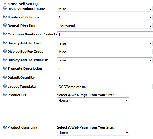
· Display Product Image - Drop-down. This setting is used to hide/show the product images on the main product details section.
· Number of Columns - Drop-down. This setting allows you to choose the number of columns of products that display on the page.
· Repeat Direction - Drop-down. If this property is set to vertical, the items in the list are displayed in columns loaded from top to bottom, then left to right, until all items are rendered. If this property is set to horizontal, the items in the list are displayed in rows loaded from left to right, then top to bottom, until all items are rendered.
· Maximum Number of Products - Text box. This setting allows you to restrict the number of products to be displayed on the up-sell section of the product details page.
· Display Add-To-Cart - Drop-down. This setting allows you to display the “Add to Cart” button for the cross-sell product.
· Display Buy For Group - Drop-down. This setting allows you to display the “Buy for Group” button for the cross-sell product.
· Display Add-To Wishlist - Drop-down. This setting allows you to display the “Add to Wishlist” button for the cross-sell product.
· Truncate Description - Text box. This setting allows you to define a maximum character length of the component’s description. By default, the entire (long) description is shown.
· Default Quantity - Text box. This setting allows you to choose the default quantity of a product when it is selected for purchase. By default, it is set to one.
· Layout Template - Drop-down. This setting lets you modify the layout of the rendered mark-up without the need of any programming knowledge other than basic knowledge of HTML, XSL (Extensible Style Sheet Language) and XSLT (Extensible Style Sheet Language Transformations).
· Product URL - Drop-down. This setting lets you complete the navigation path for the up-sell product. In most cases this will be the same product detail, you can, however, decide to create a specific product detail page for this type of product.
· Product Class Link - Drop-down. This setting allows you to determine where the customer is directed to upon clicking the Product Class link.
e. Meeting
Settings:
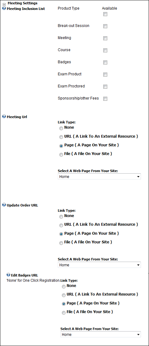
· Meeting Inclusion List - Table.
The Meeting Inclusion List only applies when the product being viewed
is a meeting. Most meeting products are defined with a list of sub-products.
In most cases, the sub products are defined as break-outs, however, one
can add products of other product classes as well.
Meeting Products that
you can include with a meeting session are:
o Break-out Sessions
o Meetings
o Courses
o Badges
o Exam Products
o Exam Proctored
o Sponsorship/other Fees
· Meeting URL - Drop-down. The Meeting
URL control enables the Webmaster to complete the navigation path for
the meeting products. In most cases this will be the page in which a user
is required to provide more information such as surveys, badge information,
etc. The control automatically populates a list of pages available in
your portal.
Additionally, you can specify URLs that are outside of the Personify e-Business
portal, including files that can automatically be uploaded on the Web
server. This can be useful when integrating with third-party products
such as Fund Raising, Certifications and Transcripts, etc.
· Update Order URL - Drop-down. Select the type of link, then click the drop-down to select the web page from your site where you would like customers redirected when they click the Update Order button.
· Edit Badges URL - Drop-down. Select the type of link, then click the drop-down to select the web page from your site where you would like customers redirected when they click the Edit Badges button. Select the None radio button if you want to use the one-click registration option.
f. Fund Raising Settings:
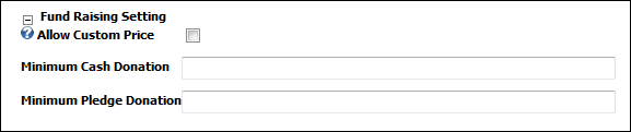
· Allow Custom Price - Checkbox. This allows you to check whether you want to allow your customers to be able to enter a custom price for the donation.
· Minimum Cash Donation - Text field. Enter the minimum cash donation, if you would like to specify one.
· Minimum Pledge Donation - Text field. Enter the minimum pledge amount, if you want like to specify one.
8. Click Update.
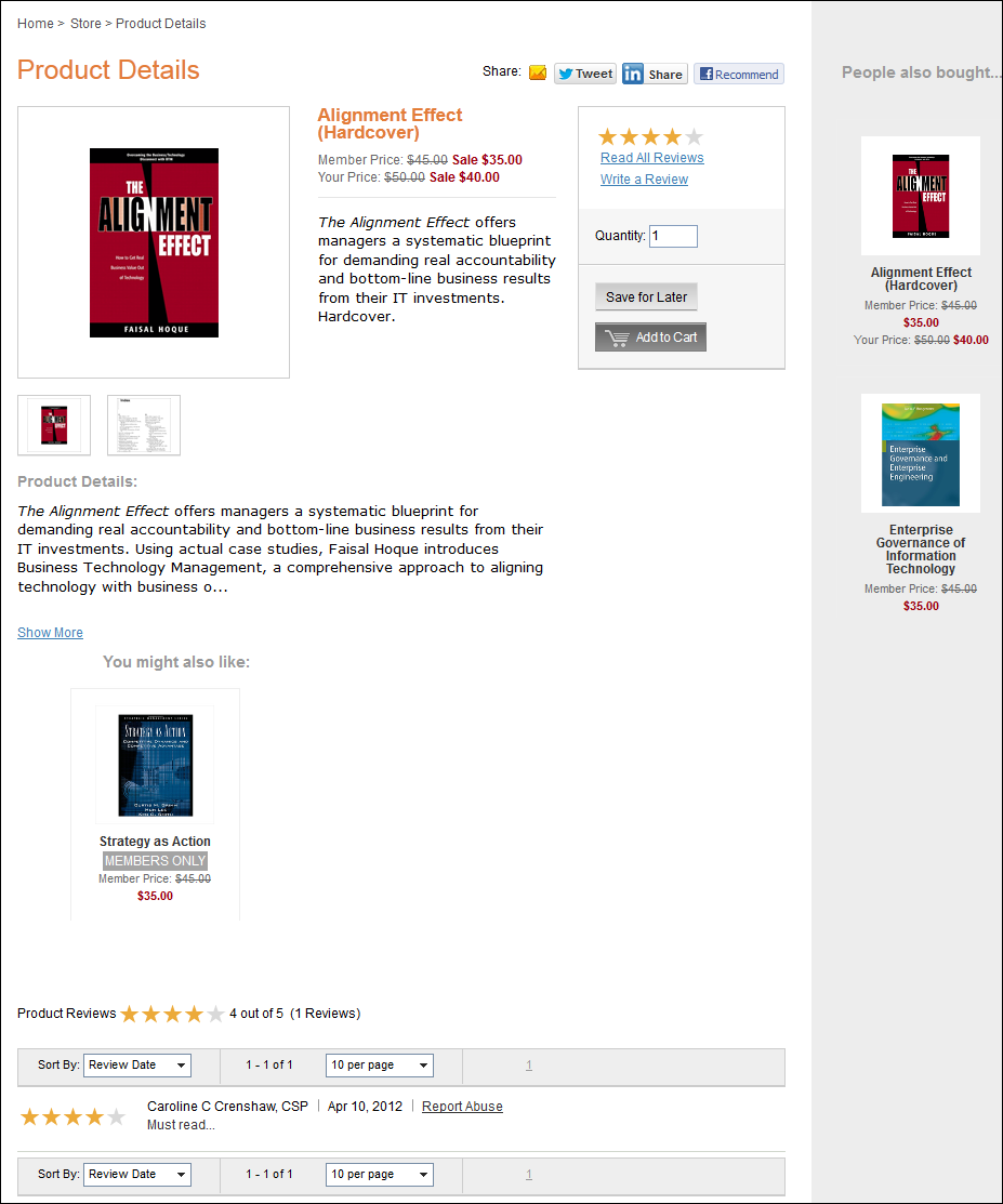
After setting up the Product Detail module, it may appear, as below, to your customer. This example displays a meeting product with list of component products and breakout sessions.
If
users are restricted to a maximum number of tickets to a session (as determined
by the meeting setup done in the Personify back-office), the limit appears
on the left side of the screen under the associated amount entry field
for each session.
The system does not allow users to add more than the specified amount for
each session to their cart.
After customers purchase a meeting, they can review the details of the meeting from the Product Detail page, including the session(s) purchased with it, by clicking the product link from their Shopping Cart, clicking the (+) icon next to the meeting from their Account page, or by clicking on the meeting product link from the Product Listing page.
From here, they have the option of either adding sessions to their meeting product or purchasing a separate new meeting registration (for example, for a guest).
Customers
are not able to modify the number of tickets associated with a meeting
purchase after submitting the order through the Checkout page.
As the administrator, you can edit the ProductDetailTemplate.xsl to configure the text that appears on the screen informing customers of the option to either update the previously purchased meeting or purchase and register for the same meeting again.