 Changes
made to banners require the user to re-launch the mobile application to
reflect changes.
Changes
made to banners require the user to re-launch the mobile application to
reflect changes.
Changes
made to banners require the user to re-launch the mobile application to
reflect changes.
The following chart lists the ideal banner dimensions in pixels. Select the size from the Size drop-down in accordance with the chart.
Operating System |
1x |
2x |
| iPhone | 320x40 | 640x80 |
| BlackBerry | 320x40 | 480x50 |
| Android | 320x40 | 360x50 |
To configure the Banners module:
1. From
the S3 Mobile Apps Detail screen, click Banners
from the Features menu on the left.
The Discussions screen displays, as shown below.
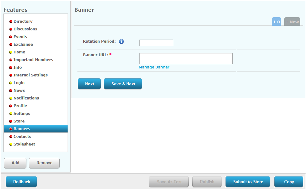
2. Enter
the Rotation Period in seconds.
TMA Resources recommends 5 seconds. If this is set to "0", the
banner will NOT rotate.
3. Click
the Manage Banners link.
The Manage Banners window displays, as shown below.
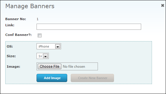
4. Enter
the banner Link.
This is the link that will open if the user clicks the banner image.
5. Select
the Operating System (OS) from
the drop-down.
Please note that if you want the banner to display all iPhone, iPad, Android,
and Blackberry, you must create a banner for each.
6. Select
the banner Size, according to
the image size.
1x being the smallest and 5x being the biggest.
7. Click
the Choose File button to select
an image and click Add Image.
If you want to add multiple sized images, repeat steps 6 and 7.
8. Click the X at the top, right to close the window.
9. If necessary, click the Preview link to preview the banner.
10. Click
Save.
Repeat steps 3-9 to add additional banners.